Tuesday 28 February 2017

Using Adobe Illustrator

Illustrator - Panic over 

Due to missing the Illustrator workshops because of poor health I really started to panic and stress about the whole software - after all this brief has a big focus on the software so it is really important that I understand the basics.

Thankfully Matt took some time to teach me the basics of the software and I'm feeling quite comfortable using it!! It all seemed a bit complicated at first but I spent the rest of the afternoon just messing around with the pen tool and anchor points and making little basic shapes. I feel as if a massive weight is lifted off my chest now as I feel I won't struggle too much when it comes to creating my final sticker.


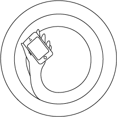
With the stickers being based on Acts of Kindness I thought I would try something relevant using basic hand and heart shapes and colour. I'm quite happy with the outcome considering it is my first time using this software but theres always room to improve.

Overall thoughts and next steps:
  • I actually really enjoy using illustrator, I think its quite fun, I'm excited to transform my roughs using this software.
  • I don't feel as behind now, Im feeling quite motivated and eager to make some really nice work.
  • Need to get cracking and draw loaaaads of roughs.
  • Develop favourite roughs and re create them with illustrator.
  • Start to consider colour - can only use two colours!
  • Continue to mess around with vectors and anchor points, practice will make perfect.


Mono Printing Workshop


Monoprint Workshop

In todays mono printing session we had some time to experiment with using basic shapes in the form of mono printing. This was a massive help towards our current brief as it gave me the chance to explore basic shapes through colour and print in preparation for my stickers.

I found todays session really fun and interesting, I've done mono printing previously but in a completely different way so today was completely new to me. The thing I liked most was that I found it really easy to just absolutely wack out loads of prints, sometimes I wasn't quite sure what the outcome would be - there would be loads of random shapes and lines left from the previous prints but it was all just bit of experimentation and some turned out fab.


really love that grainy effect the paint leaves when you re print the same piece.


how can shapes create such lovely pieces of work - the blue and the red work really well together in this piece.


so simplistic yet sooo effective. Love this basic print although it only consists of 2 shapes I think its such a powerful piece!


Things to remember about mono printing:
  • Don't use too much ink - listen out for the sticky noise it makes when rolling.
  •  The easier press will create block colours rather than the other presses which create more grainy outcomes. (this is due to the pressure)
  • You can use the coated paper rather than cartridge paper straight after a print because the ink dries faster and sticks to the paper which allows you to re print straight away.
Overall I think this workshop has really helped me consider shapes and colour and will urge me to think carefully in choosing for my sticker designs.

Digital sticker designs


Love this design, I think this works best as a final, it looks finished, the shapes are tidy and neat (I also spent a long long time on it)


I created this outline compltely forgetting that I had nt made it in  layers! I was so pleased and the lines where abslutely perfect but somehow I got carried away and did it all on the same layer so unfortumtely iy only looks good as an outline, I could perhaps edit it on Photshop but it would defeat the whole Idea of using Illustrator.


I re did the design I really like it but the hand kind of merges into one and I cant decide if I like it or if it just doesn't work.


This was my first edit, I think its great in terms of basic shape, not sure on the colour scheme though.


I really love this little fishy design, its unfinished but I still really like the shapes involved in this design!! wish I had time to make a series of these!!!


Saturday 25 February 2017

Geoff Mcfetridge

Love the use of Shape and colour!


An artists that has really influenced my work throughout this brief is Geoff Mcfetridge. His use of basic shape and limited colour palete provides the viewer with such a simplistic tone of voice which is so incredibly powerful much like the image I have provided. Mcfetridge has influenced my use of basic shape and has urged me to be more selective with my colours. I love his used of pale and washed out colours in this piece, It's something to take into consideration when creating my designs digitally.

Act of Kindness Roughs

I'm really happy with the outcomes of my roughs, I think I've covered varied topics based on acts of kindness. Ive also gone for varied styles such as detailed in comparison to simplistic shape.


I love these fish roughs, theyre so fun and playful, I'd at least like to experiment with these on illustrator just to see the outcome.


In terms of which ones I will develop digitally, I think I'll go with my most sucsessful image which is the "Call a friend based ones" I think Ive really thought about shape and colour in these ones.

Wednesday 22 February 2017

Act of Kindness

What is an act of kindness?
A random act of kindness is a nonpremeditated, inconsistent action designed to offer kindness towards the outside world.

Today we got given our new brief and it was already sold to me as soon as the word 'stickers' was mentioned. I think its a really lovely brief and I cant wait to see what comes out of it.

Starting points?
  • Be kind
  • respect your elders
  • compliments cost nothing
  • keep smiling


Monday 20 February 2017

Final GIF's


Overall Thoughts on GIFS

  • Yayyyyyy I actually made a GIF!
  • Overall I found this brief quite stressful, I didnt feel like I managed my time well at all.
  • I wish I had more time!!! I wouldve loved to spend more time on these GIFS - just before the deadline I found myself really having fun with these (I hated it at first)
  • I think my fav is the witch pulling up the cloak - its always nice to add a bit of humour!
  • I think my 3D GIF is quite spooky? however I could've expanded on the idea by adding a face?


Visual Language: Colour and Value

Colour and Value

What is Value? Different varieties of a colour - gradient?
What are the different types of colour value? Light against Dark, Dark against Light, Dark and half tone and Light and dark against half tone.

One of my favourite examples of work which successfully uses colour value is a piece by David Foldvari. This image provides the viewer with a Dark against half tone image where the darker values appear to come to the viewers attention slightly more in comparison to the half tone values which are held in a number of the figures  - however the information that is half tone is not lost within the image and the dark tones (even though a lot of infomation is in this tone) don't over power the image.


LOVE LOVE LOVE SCREEN PRINTING

I absolutely loved this task, I'm starting to really enjoy doing screen printing - the whole process, I  just love the excitement that you get when you rinse the screens and see that yellow!! - This surprises me due to my ABSOLUTE  hatred for it at foundation. The idea of of this task was to create a fan art poster using 2 colours - so with the limited colour palette it was incredibly important to take white into consideration as it of course acts as another colour.


I really wish I could've spent more time on my poster in terms or creating roughs and planning more thoughoroly but I think the most important part of this task was being able to re visit screen printing. I feel that if I was to re visit screen printing again (which I defo will!) I would be able to confidently do it on my own.


Digital Roughs


  • My favourite is definitely the greyscale image with the red bullet (was originally intending to print this one!!! would really like to go back and do so)
  • I think the black outline in my final stands out more and contrasts nicely with the turquoise back ground - this is why I chose it I also feel as if this colour is more representative of my character, feels more mysterious and cool.
  • The red design takes away too much attention from the character although would still make a lovely print.


Final Design

  • I used black to outline my character as it not only represents his personality - dark, scary, cold, but it also is very visually clear, its the first thing you're introduced to when looking at the piece.
  • Turquoise works nicely I think, again another representative of the character (it also looks really nice with black)
  • I decided to make use of the colour of the paper (white) as it extends my colour palette a little.
  • I really like the white bullets, maybe perhaps if I was to revisit this task I would play around more with the opacity of the smoke and the bullets??


Any problems encountered?

I slightly messed up my poster which I was a little annoyed about but I'm completely aware of my problems and I now know how to avoid what I did (its all a learning curve????). I tried to use bitmap to achieve a paler value of the colour I was using, but the resolution and dpi was way too high which meant that on screen it looked really nice and I achieved that paler value, however when printed out it appeared slightly blurry and the screen wasn't able to pick up the perfect in line dots like it would've done if I had chosen a lower dpi.


I think it was actually kinda tricky getting your head around what colour is going to be what - because obviously the psd had to be grey scale for the whole process to work, so after creating my final design in colour I had to go back and completely re do the whole piece, and no matter what colour you had chosen you still had to black it out for the screen to pick it up - i don't know it just gets a little bit confusing. I think the easiest way to do it was to just make two different documents or two different layers for your two colours and just think - the bit i want to be in colour is what needs to be black??


Final Posters


I'm really pleased with the outcome (other than the crappy bitmap job, oops), I think the colours both work really well, I think I'm slightly more into the turquoise one just because it compliments the black nicely and I think it fits with my characters personality more - seems mysterious and cold (like him) I tend to struggle with composition a lot but i think I'm liking it within this design - the bullets and the smoke are nicely placed, maybe if the bit map worked it wouldn't interfere with the title as much?


Saturday 18 February 2017

3D GIF

What I have used to make it 3D, What materials?


I decided to go with play-dough - I gathered that it is easy to mould and will stick to anything. I used a makeup remover bottle as the base of my character this made it easier when it came to taking pictures as it was nice and stable and the paper was easy to stick to. I then similarly to my sketchbook work used ink and water to create that mysterious look for the purple cloak and used paper cut for the hair.

I then had to steadily place my phone on some books so that the photos were all from the exact same angle - I then moved the charater closer to the screen so it looked like it was coming at you! ahhhhh.

I feel like if I had longer on the project it would be good to maybe include a face? not that it necessarily needs one..you get what my character is all about in this GIF it's mysterious and spooky and I think you completely get that from the movement in the GIF.

Friday 17 February 2017

I See Faces: Min Liu

ABSOLUTELY LOVE.

Min Liu
Min Liu is the creator of "Blood Diary' which is a daily animation project where she creates a piece of animation every day for 100 days. I find her work and tone of voice extremely fascinating and I'm feeling so inspired by her work.


I really love the colour scheme, the red contrasts really effectively with the black. This piece above reminds me of screen printing for some reason and I really like it??? like the hands look like they have been printed.I just love the use of these severed hands!!! the colours really compliment the whole theme of her project which is something to consider in my own gifs. It;s clear that lei doesn't use too many frames, and I think this is why it works so well, there isn't too much going on in the animation so its not too overwhelming.


Thursday 16 February 2017

Experimenting with GIFs

I wasnt really too sure how they worked????

It took me absolutely ages to get my head around creating GIFs on Photoshop, I failed miserably in class and got so fustrated that I gave up so I decided the only way to get better is to practice!!I had a little help from online tutorials but in the end I think I seemed to have got it? I created a cute lil GIF of my guinea pig wiggling his bum (he does it when he's hungry).

Overall thoughts
  • Get cracking and get my witch moving!
  • I'm actually quite proud considering this is my first GIF? he looks kind of cute!
  • in terms of the movement I think I've done quite well - theres two types of movement happening the bum and the eyes - something to consider in my final GIFs.
  • Obviously its not perfect theres always room for improvement but I feel like my hatred for GIFs isn't as existent anymore.. I feel more comfortable in this area.


Friday 10 February 2017

I See Faces: Group Tutorial

Today we had group tutorials and got the chanace to see what everyone had been up to in terms of sketchbook work, it was so nice to see busy full sketchbooks!! I really feel as if I have benefitted from the group tutorial - it was also good to actually be productive throughout one of these tutorials in comparison to the slightly more formal ones. there was a lot of drawing invloved - drawing of eachothers chrcaters, we had to add things, draw them in different ways, which was really useful because it expand the variety of charcaters you could have.


Sunday 5 February 2017

I See Faces: Experimentation, Sketchbook Ideas

Sketchbook

My initial idea was to create a witch as I felt it fit appropriately with my given music, I began to  explore its characterisation through collage, What I was trying to achieve with these witch images was a sense of mystery and in some sense I was trying to make her a bit scary because it's what I thought would fit best with my music.


I decided to mix it up abit and focus both on shape and block colour but I was also curious as to what I could create when adding detail - I feel as if the detail helps convey this mysterious and spooky witch??


Papercut, Shape and Texture


I really love paper cut!!!!! I think its such an aesthetically pleasing method to carry out. I wanted to try and step away from the more detailed characters as after all these were going to be turned into GIFS? I think GIFS such look better when focusing more on shape and block colour. I feel like they look more professional rather than just making a detailed drawing 'move'. my next step was to focus on the face and portrait of the character which is why I created the faces below..

Im also loving making little textured work sheets which I can cut out and use on what I think should be textured o the character e.g the hair.


I think this is a really effective way of working - its fairly quick and by adding texture among block colours it really contrasts and works incredibly well.


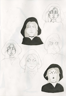
Do they need faces? are faces necessary? will faces help convey my personality an background of my character? perhaps not... but it was good to experiment with facial expressions to see which would suit my spooky mysterious witch the most, I think I'm really set on the first one? 

It's probably quite obvious that Ive had a lot of fun experimenting with ink and water to create the ink splatters - I think it's such a successful and effective way in help portraying the mysterious feeling, it also looks extremely witchy which hey thats what I'm going for. I decided that I again wanted to simplify things - this was my next step and the outcome is shown below.


More examples of working with texture - again I love the faces I think they really add to the character and give it personality but could this be shown in another way? e.g movement?


more examples of quick ideas I had in my sketchbook.


I then created a unicorn gal - the music had a mythical theme to it so it fit perfctly, although I dont think I will carry on with this idea, I think my witch idea is more effective.

Overall thoughts and next step.
  • Need to consider movement - after all thats what a  GIF does...
  • maybe jot down some ideas on what I could make the GIF do? 
  • think about simplifying this will help make the gif look clearer.