Editorial brief

Jon Han
Dadu Shin
Gizem Vural
Roman Muradov
Lisk Feng
Paul Blow
Josh Cochran
Jean Jullian
Task : Produce three different illustrations that visually communicate your response to a single given text. Illustrations must consist of two colour stock and be designed to work within the following three dimensions:
- 200mm x 200mm
- 105mm x 200mm (Portrait)
- 290mm x 105mm (Landscape)
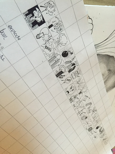
Before we were given our individual texts for our brief we were each given a word and squared graph paper so we could illustrate as many ideas as we could in each little box. The idea of this was because we were drawing so small and quick, it would allow us to generate more ideas one after another and because the word could be so random it helped us generate random ideas that we may not have been used to drawing.
My word was 'Explode' so this meant I had to illustrate as many ideas as I could to portray the word 'explode'. After we had drawn as many as we could think of, we then got put into groups and had to write down on each others sheets a word in which we thought were relevant to each others drawings. I found that the more ideas everyone drew the easier it was to guess which word it was.

This was a really helpful and interesting technique to carry out as it prepared us for illustrating our given texts which much like the words we were given, it would be completely random.
Once I received my text, which was based on loneliness and mental illnesses, I got together with other students who had the same article and analysed the text.
I thought it would be interesting to see if i could carry out this same process with my given text. I found that it was very successful as in under a few minutes I had produced a range of tiny ideas based on my text and the word 'lonliness'. I think this is something I will carry on using in the future.

Throughout the briefing I was introduced to some interesting artists which appeared throughout the presentation, these included:
Jon Han
Dadu Shin
Gizem Vural
Roman Muradov
Lisk Feng
Paul Blow
Josh Cochran
Jean Jullian
I would in particular like to research Paul Blow and Lisk Feng further as their work appealed most to me.


I really admire Paul Blow's use of line work and block colour, I think it really gives the image a unique and strong tone of voice.

I absolutely love the use of texture and shape in Lisk fangs work - this is something I would definitely like to experiment with in my editorials.

Due to our editorials having to be made up of two colours I think its really important to carefully consider what colours you are going to choose and how they represent the image. I think Lisk Feng has chosen appropriate colours for the image above - the blues and reds both work extremely well with each other and the piece itself just looks beautiful.
Whats next?
The next step from here is to produce three roughs for each format (nine in total) for our next session.
I began the task by experimenting in my sketchbook whilst not using the given dimensions, as these were just my roughs and they didn't have to be exact. I began to consider how I could represent the theme of loneliness and after a tutorial with Jamie he spoke about how you could portray loneliness in other ways rather than using people and their feelings. I started to base my first lot of roughs on nature and drew things such as singular falling leaves which initially produces a sense of loneliness without using people.

I liked the idea of using nature as a starting point but I think it seemed to steer away from my initial theme.

I then moved on to creating a sense of loneliness by using people and their body language. I feel that this idea was more successful and the images fit better with the article as it was based on people and mental health. I found that drawing people allowed me to generate more ideas and the roughs were just flowing out so I decided to continue with this theme.

A main aspect of this brief was that we could only use 2 colours (and the other values of that colour) so I experimented with blues and purples which I thing associate well with the theme of loneliness. I also used reds and yellows which I don't think represented the theme very well however I do think it still looked visually appealing.

In preparation for my final editorials I picked the images I was most happy with and which I felt represented my article most. I played around with colour and tone and found that I was slightly unhappy with the outcome. I used two different mediums ink and pro markers, the pro markers seemed bit blotchy and there were noticeably white marks which didn't compliment the image and the ink came out in a similar response.
No comments:
Post a Comment