Excited to design a book cover
For some reason I was really excited about this brief, it was simple and straightforward - we had to chose a book from the library and design and illustrate a new cover for it. This was a design project which was heavily based on Visual Communication.
My book was called 'Representing Women' and was based on how women are portrayed in popular media. It was a really interesting book from the few chapters that I read, but sadly It had a pretty boring cover so I was really excited to transform it. I think its really important for a book to have an interesting cover - its what makes you pick it up in the first place.
Roughs
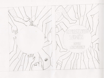
The first task was to create 5 roughs so before I began I considered what are the visual motifs? I began to think of really stereotypical girly motifs such as makeup, handbags and skirts etc in which I could draw - because these things are what stereotypically represent women. I wanted to also contrast this with what aspects natural women have like hairy legs and muscles - these things are natural however may be frowned upon due to how the media have portrayed women. overall I asked myself a general question of how are women depicted visually in popular media? and I pretty much based my drawings on this.
visual motifs:
- Nail varnish
- Bras
- Lipstick
- Glasses of Wine
- Perfume
contrast with how the media depicts women - Hairy legs
More visual motifs:
- makeup brushes
- hair brushes
- perfume
- lipgloss
- high heels
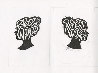
I really like the font in the silhouette of a womans head - simple yet effective.
This is probably my favourite rough, includes lots of different shapes and sizes of women - none of which are your 'perfect woman' which is usually presented in popular media (slim, long blonde hair, full of makeup). I want to work with this further maybe digital?
Inspiration from Book Covers
Angela Carter - I really like the shapes of the figures, this encouraged me to simplify my figures on my roughs rather than drawing them with a lot of detail like I would usually do. I also love the use of 4 block colours, such a simple design but would really pull the viewer into reading the book.
Karl James Mountford -I absolutely love the busy feel of this cover! although the cover is FULL of detail, the shapes still remain simple so it doesn't confuse you too much on what the book is actually about. I love how the rain coat on the girl stands out from the rest of the colours, it brings your attention to the main aspect of the book.
Cleon Peterson - This is one of my favourite book covers, just by looking at this cover it makes you instantly want to pick it up and read it, the shapes, colour scheme and typography all work together so effectively and the use of negative space is considered carefully, space isn't wasted in this cover and this is something to keep in mind when creating my final cover.


No comments:
Post a Comment