Monday 30 January 2017

Visual Language: Frame


Coming to terms with Frame.

In todays session I didn't exactly love the outcome of the task, although I have left with gaining a lot more knowledge and practice on studying Frame. I wasn't looking forward to todays session purely because I know considering frame is sometimes quite a struggle for me and I find it difficult deciding on what element of my image should go where or should I over lap etc..

With the help from a sheet the class had been given, I was able to understand the concept of frame a little more easier and in a little more depth.

How can we place importance on certain information within the frame? Its very important to consider elements such as Tone, overlapping, cropping, scale..

What are the benefits of overlapping objects? It's a good way to organise objects and making things prominent, it also can create depth within the frame. Overlapping provides a good way to organise varied objects into interesting unified shapes.


Important points to remember:
  • Dont split the picture in half.
  • Use the whole picture area.
  • Don't line things up.
  • Vary the placement.
  • Don't crowd the bottom.
  • Use the upper half too, its a mistake to waste any of your picture area.
  • Dont centre everything.
  • Move things to the side.
  • Don't leave a hole, this will occur when you line things against the boarders.
  • Make good use of your space.
  • Don't let the objects touch.
  • Overall the objects.


Of course rules are meant to be broken and I think its important to remember that you don't have to stick by "rules" and if I personally like the way an image looks when it doesn't fit in with specific rules then that is ok...


Looking at examples of the use of frame in Artists work:


It was really beneficial to have a look at some examples of successful uses of frame in other artists work, one of my favourite was by Dadu Shin. I think the composition of this piece is really beautiful, the bottom heavy image provides the piece with empty space and makes the image seem silent which is what I'm sure the artist is trying to convey. This piece is a visual representation of insomnia and I think the colours really reflect this successfully. In terms of frame I can really appreciate the overlapping of the body-like shape above the character, it makes the image seem real.


After having a class discussion on frame and arrangement it was our turn to have a play about with the concept. We were given 3 objects to experiment with - an elephant, yourself, and a butterfly. After the previous composition task I feel as if I understand the concept a lot better, and I've realised that the more I practice with it the more comfortable I will be with it.


  • After this task Ive realised the importance of roughs, its really difficult to just have one idea and get it done without testing out loads of different concepts.
  • I'm not majorly happy with the outcome but this was because it was very rushed, so maybe spend more time on experimenting with composition again?
  • I also HATE working on such big scales!!


Introduction to Visual Communication

Love the sound of this brief, feeling very motivated!

In todays session we were introduced to our final module: Visual Narratives. I'm really excited about the sound of this first brief 'I see faces' I'm feeling really eager to get started. The whole idea of this brief is to develop a character in response to a given piece of music.

The music I picked out at random:

J Dilla - Fuck The Police
Burial - Homeless
Hookworms - Retreat

Initial thoughts on my selection of music without listening to them:
Fuck the police - quite funny, I could create some really nice characters based on 'Girl Gangs' similar to what Hellen Jo creates. I really don't know what to think of the other songs as I haven't heard them before. Maybe my next step could be to listen to the songs and write down some words or images that come to mind? - This may be useful in creating my initial shapes for my character

Visiting Lecturer Dominic Kesterton

Dominic came to visit the class today and spoke about his practises and his career as an illustrator. I really like his work - it is something I will further research, I feel as if I will be able to take a lot of inspiration from his work and it will inspire the tone of voice in some of my characters. I also feel as if the lecture has made me feel more confident in choosing illustration as a career.


Dominique k - really like his work - has made me feel a lot more confident in choosing illustration as a career.


I See Faces: Character design

Initial thoughts on character design?

  • Ive never really done it before.
  • its something I've never really been interested in?
  • I'm excited to give it a go
  • the brief sounds really fun.

I enjoyed todays task on character design - i thought it was really beneficial, e basically had to draw simplistic faces and each time we passed it onto a peer and added something to it and the process just continued in that manner. We learnt how powerful it is to add something or change something within your design and how it can become very interesting.

Sunday 22 January 2017

The Untold Story Part 2: End of Module Evaluation


Overall I am really pleased with the outcome of this module as a whole, due to the fact I was seriously ill over the christmas period, I really feel as if I picked myself back up and absolutely pushed myself to the best of my abilities for the final bit of my project.

I’m really pleased that I can now screen print! it’s something I've always been interested in doing but had no idea how the process works, I’m really excited to revisit this part of the module to make some really cool prints as an individual.

I think it was a bit of a struggle for me at the beginning as I really wasn't happy with any of my subjects I was given for SB2, and it took me a while to actually get stuck in. I think as soon as I started to get my transcripts it started to pick up a bit from there. This was a really interesting way of retrieving research for me, and I think I learnt a lot from this. I found that just from having a conversation with somebody, which was so casual, so many ideas can stem, and initially my whole book was created from this form of research. Other than the field trip and the interviews I used basic research on the internet - I think I could've pushed this further by having a look at some books related to my subject.

For SB3 I feel like I have never pushed myself so hard in my life, my days would consist of 6-7 hours of work at home after studio days, sometimes I would be up until early hours of the morning, still working in my sketchbook - this suggests that although my poor health was something I couldn't avoid, I could at least try and manage my time a little better in the studio, sometimes I would find myself being a little distracted, this could be easily avoided with a little more concentration. In terms of SB3 I really feel as if a transformative moment occurred straight after my tutorial, I had a completely different attitude towards illustration and I finally started to give myself credit for my work, I started to not only enjoy creating images but I literally couldn't stop myself. I think I had a transformative moment in my tutorial purely because of the advise I was given by Matt,  although I was behind and I had a lot of work to catch up on some great ideas sparked and I finally had a sense of direction for the project. It goes to show that all you need is a little push!

I think although I much prefer working at home in my own space I need to consider working in the studio more often, reason being that there are so many creative individuals working in the studio space, it just seems more like a sensible working environment, also its a great place to get advise on anything work related.

The best thing to come out of SB3 is the fact that I have been really open with experimentation, If I was to change anything about this project it would deftly be to consider my initial research more appropriately. I’ve had a read back from my previous End of Module Evaluation and there still seems to be a little problem with managing my time, I have noted this again and will really try my best to act on my time management skills for the next module.


The Untold Story Part 2: Final Book


Finally finished!!!!


What went well? 

  • I feel as if the book has a lot of energy and has a really energetic tone of voice.
  • I really like the format of the book it feels really nice to just hold.
  • I really like the simplicity of the front and back covers, If I over complicated it people may be drawn away.
  • I really like the use of mixed media - it really drags you into the book.
  • overall I really enjoyed making the book, if I had more time I would definitely make a few more!
  • I feel as if I have learnt so much through out this module which I'm really pleased about.

What could I improve on? 
  • There is one page that is slightly out, unfortunately I may not have time to fix this - it was just down to error and unfortunately it was something I completely missed and only realised last minute.
  • I feel as if the binding looks a bit messy, it was my first time trying this method so I'm not too sure about it.
  • The pages seem very mix-matched due to the use of mixed media - I'm not sure if it works? I'm not sure if I prefer the mock up which contains just illustrations.

Saturday 21 January 2017

The Untold Story Part 2: Artistic Reference - David Hughes

David Hughes.

One of my all time favourite artists who has been a big inspiration to all my work so far for this project is David Hughes. I absolutely love his work and his distinctive tone of voice throughout all of his work. The characterisation in his work look so effortless yet appears so detailed at the same time. I figured that looking at David Hughes work will help me so much as I find it really difficult to simplify my work, and although Hughes drawings are fairly simple, there are defiantly elements of detail and business in there - this has really helped me simplify the characters in my drawings whilst still allowing me to include elements of detail.

I can really admire something a lot of his characters include throughout his work and that is the abnormal features such as giant faces or facial features, I think it really gives a sense of humour and the fact that Hughes is sometimes being a little ridicule.


Friday 20 January 2017

The Untold Story Part 2: Playing with Photoshop, Prep for Final Pages.

Moving away from traditional methods.

I decided to make a start on my final pages. My first step was to edit my initial drawings and collages on Photoshop. I was torn between the using the collages and my illustrations so I thought it would be a good idea to merge the two - I feel as if it really prevents the image from being flat and allows the piece to have a form of relief.


To again prevent this image from being flat I decided to add a slight background which involves text, I didn't want the text to be too over powering so I turned the opacity right down to make it only just readable.


I really didn't like the idea of using text through Photoshop - I think it looked too fixed and really didn't fit well with the tone of voice of my images. I decided to hand write some of the phrases that were accompanying my images and I really liked the whole handwritten font. Once scanned in and fit onto the images I was pleased with how they looked and decided to keep them that way.

Keeping in mind what was said in the crit I made sure to remove all of the inverted commas - they looked much better without them.

Problems I encountered when printing.

Once I was finally happy with my final images I decided to print out the book. Unfortunately InDesign wasn't on my side today and I completely messed up the printing process and I was a bit stuck right at the last minute - If I've learnt anything from today it's don't leave printing til the last min!! fortunately I managed to grab a computer resource technician who guided me through the printing process and pointed me in the right direction. I'm now confident and have realised my problems for next time. Once I had printed I wasn't happy with some of my images, some turned out completely different printed out in comparison to on screen - so I went through the whole book page by page and identified what I didn't like and went back and edited them ready for the final print.


Thursday 19 January 2017

The Untold Story Part 2: Transformative Moment

I L O V E making work at the moment - Transformative Moment

It's amazing how much you can enjoy yourself when you really get stuck in I really feel like my whole mind set on not just this project but illustration as a whole as changed, and definitely in a positive way. I feel as if I'm really making up for the time I lost when I was ill over the holidays. I've made some lovely drawings that I'm really looking forward to developing.

I've noticed, I think the main thing that has made things really shift is the advice Matt had given me after my tutorial, I was really panicking at the lack of work but rather than making me panic more we came to the realisation that we cant go back and change things - we can only move forward and make up for the time lost whilst I was ill - and that is my exact intentions for the next couple of weeks.

The Untold Story Part 2: Experimentation and Development

Experimentation with Collage

I wanted to really push myself and extend my work - was it the drawings that just weren't enough??? was it my idea that just wasn't working??? I really like my idea and it's too late to change so my best bet is to get cracking with some experimentation. 

I was eager to include some collage into my work - I think using collage allows the work to really stand out - it gives it a complete new tone of voice and it's something I really enjoy. I decided to experiment with Ink, Line quality, shape and texture to develop my initial sketches, this meant carrying out some problem solving in order to prevent my images from looking flat.


Focusing on Shape, Texture and Line Quality.


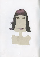
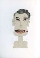
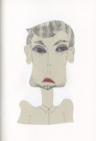
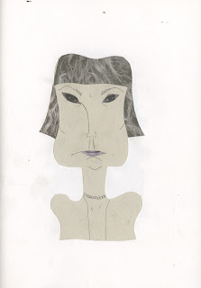
I carried on the characterisation that I had been working with in my previous drawings representing the "annoying nagging mums". I think what works best with this image is the simplicity of the shapes and facial features - I think the hair texture works really well, it prevents the image from being flat and dull. I had previously been working with just black and white so its nice to see how the image transforms with even just the slightest bit of colour.


I carried on collaging with bits of hair and facial features and the outcomes are really successful. I decided to experiment with a different character purely because it could possibly lead me to different ideas and my previous character was becoming a little repetitive and boring. I think these are some of my most successful collages because they really portray their description of annoying nagging mums.


I then wanted to create texture in another way rather than taking bits and pieces from magazines so I created my own textures using ink. Not only was I thinking about texture in this process but it was important to think about line quality (creating lots of different lines and squiggles) and shape (for the shape of the hair).

Overall thoughts and next steps.
  • Really pleased with the outcomes!! such a nice difference in comparison to my original drawings - really love seeing the development.
  • I feel like I'm progressing really well and in such a short amount of time.
  • I'm quite eager to start scanning in my images in preparation for my final pages - so I can manipulate the collages through Photoshop.
  • Really need to start considering pages for final book.