Tuesday 28 March 2017

End Of Module Evaluation

Overall I’m feeling extremely pleased with the majority of this module, I feel as 406 has been the module where I have stepped most out of my comfort zone, and by doing so I have started to identify reoccurring themes, styles and tones of voice throughout my work which is something I’ve always been slightly concerned about in terms of not having my own style or specific type of practice.

I think the majority of this module included some form of learning for me, whether that was learning how to create GIFS or learning how to use Illustrator, every brief has hit me with something I was unfamiliar with this wasn’t necessarily a bad thing I consider this as a really good aspect of this module because it meant I’m getting as much as I can out of my course and I’m learning new things on a constant basis.

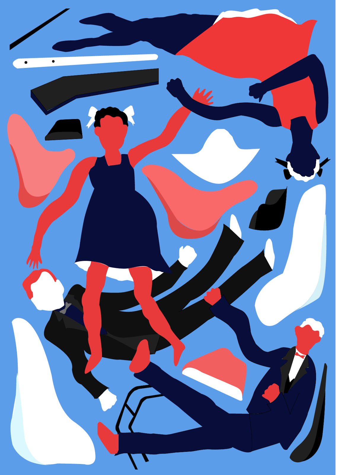
Something I’m really pleased about within this module and what I think has completely made me alter my thoughts on illustration as a whole was the mono printing workshop. I feel as if this was the starting point in which has made me completely fall in love with shape – my attitude towards it has quite literally flipped. Looking back on what I thought about shape and colour right at the start of the year is the complete opposite of how I think about shape now and I find that absolutely amazing how in such a short period of time my attitude and thoughts towards illustration have changed dramatically.

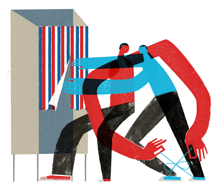
I’ve walked away from 406 with not only a huge amount of new knowledge on different analogue methods and techniques such as mono printing, but I feel so much more comfortable in terms of working digitally. Illustrator is a software that around a month ago I was terrified of using, I was dreading the moment that we would be introduced to it and had to use it as a part of our brief – which we did, but I’m so glad that that time did come because it’s something I really enjoy using and I felt like it will play a huge and very important part in my life as an illustrator.

I think the most important thing I’ve come to realize throughout this module is the importance and power of roughs! Previously I haven’t been taking much time and effort to rough my ideas, however in 406, particularly in the third brief, I have finally come to realize that roughing is so important and so many ideas and paths can spout from creating them!


Something that I’m again not happy with is my time management. This is a re occurring theme that I’ve come to realize needs to improve. I now know that this is a weakness of mine and it will be my main priority to organize in my next body of work. Unfortunately, something I wasn’t in control of this module was my job which interfered especially throughout my last brief – fortunately I feel as if I was able to successfully pick myself up and redeem myself

Final Outcomes

Post Cards


Stamps


Poster


I changed the final poster to the more natural coloured one, I just think the colours are more representative of Ray and Charles and most importantly I think its more aesthetically appealing, I'm glad I experimented with other colour schemes and I cant seem to make my mind up on which one I like best (It will definitely change) I'm overall really pleased with my effort on illustrator - considering its a software I never used about a month a go -  I would say I'm really starting to get the hang of it. I also changed the purple and green postcard because I just didnt like the look of it, the new colour palette suits it much more.


Monday 27 March 2017

Final Crit

I loved the style of todays crit, I feel like in groups of three it was really easy to give some final bits of feedback in prep for submission, I feel as if I gave some really good feedback and advice and I just wish I could have got the same in return. It's a bit upsetting that you sometimes wont get the same amount of feedback in comparison to other students or in comparison to the feedback you gave out, which is a shame because I feel like I could have really benefitted from it! It's also really annoying that I put so much effort in the night before to ensure that all my work was ready for a crit and I got nothing back other than "purple and green?" written on a piece of paper which doesn't really suggest anything to me? quite angry really, especially because my partners got so much ore feedback than me. oh well, maybe next time?

Potential Final Outcomes


 Stamps:


Overall thoughts:
  • Realllly love the orange stamp, i feel like theres not too much going on but it definitely isn't simplistic, will have to see what thoughts are in the crit later on today.
  • they look really good on screen and as a series of images however is the blue one too busy? I've got to remember that it will look a lot smaller printed out!! perhaps changes will be needed before the deadline. Will be able to see what people say in the crit later on today.
  • is the darker blue one also too busy? 


I'm still indecisive - Possible A2 Posters:


  • Does the dark blue and pink image look better as an A2 print out? the business of these images work well on a bigger scale purely due to the fact you can see all of the infomation a whole lot clearer.


Post cards:


  • I love each image but they dont work well as a series.
  • either the colour scheme need to be chanaged or I need to have another option to make the series look more aesthetically appealing.
  • The more I look at the purple and green the more I dislike...changes?


Sunday 26 March 2017

Poor time management

I'm so terrible at managing my time, it's something I reallllly need to work on, its a reoccuring theme within my work - I'm glad I've recognsed this because this is going to be my main priority for next time. I'm now cramming in alllllll my work for my digital designs the day before the deadline for the crit! so...

How can I manage my time better?
  • Keep a diary.
  • Make timetables and schedules.
  • Record audio notes.
  • BLOG THE SAME DAY AS THE SESSION.
  • KEEP UP TO DATE WITH BLOG.
  • Set myself daily targets and try really hard to meet them.
  • Discuss work with friends, they might be way ahead of me, it will give me a heads up!
  • Make sure work doesn't interfear with classes.
  • Make constant notes.

Colour and influences

I   H A T E  CHOOSING COLOUR

I've always found that choosing colour is one of the most difficult things to do! its the thing that really polishes off your piece and it frustrates me so much that I find it so hard! I've tried using the Adobe colour picker but still I struggle so much and it never looks right. I decided to think back and look at some examples of work where I really appretiated the colour scheme.

One piece of work unfortunately I dont know who created it was something that I have had held of from the beggining of the year, I like to collect examples of illustrations which are on promotional flyers or leaflets promoting clubs and bars which was what this was.


Every time I've looked at it on my wall I've always appreciated the colours so I thought it would be a good idea to interpret this in my own work.


I think this piece is more successful than others, I like the unrealistic skin tones which match the un realistic body features, it's wacky and unique and I think is a potential final for my poster. Thoughts - are the colours to random? do they make sense? do they need to make sense?


The colour scheme on the piece above was designed fairly random, I decided to keep the skin nude and pinky tones to keep it fairly normal looking, and then I stuck to a turquoise, deep green colour scheme purely because I liked the look of it,  I think its a nice and colourful piece and represents all the colourful Eames chairs effectively.


I also came accross this screen print a while back when focusing on the screen print brief in a previous module. again the thing about this image that attracts me most is the colour palette, consisting of only 3 colours. I love the use of the two blues and in contrast the red, also I admire the fact that white is not wasted as a colour, Till Hafenbrak has used white very effectively which expands his 3 colour palette to technically 4. 


After looking at Hafenbraks work I soon discovered a similar colour scheme worked really well on my own piece of work, I feel it works extremely well in a sense of the red portrays Ray and the blue portrays Charles, although it is stereotypical it does genuinely work. again the crazy un realistic colours suit the persons of note as I feel it mirrors their personalities and ways of working. I think this is probably my favourite outcome, it links more with my research and background infomatiom and it look aesthetically pleasing.


I'm not entirely sure on this colour choice? I do really like it but I think the purple and green might contrast a little toooo much? I think more experimentation is needed really before I can decide on a final outcome. I think one thing that I'm a little unhappy with within this piece is the edges on some of the vectors - they're  little sharp, think i need to work on my curves a little more to create perfection.

I got the inspiration for this colour scheme to one of my all time favourite pieces of work created by Ellakookoo, the colours are so vibrant, they literally just pop, I would've never have thought of using this colour combination  without looking at this piece of work but I think they work so beautifully as to why I tried something similar.


Moving onto digital means

Analogue to Digital

I decided to take my most successful rough and develop it through Illustrator after all moving on to digital means was suggested on my critical feedback, it took a lot of time and patience as I was still coming to terms with using vectors and illustrator in general! but I'm pleased with the over all outcome I think it really conveys who and what Ray and Charles are really about - the explosive furniture, the bodies reenacting the furniture and although the figures dont have faces do they need faces? you can still recognise who it is.


What I like about this piece:
  • I think this piece of work is really sucsessful in terms of focusing on shape and colour - this is very important in relation to my persons of note who both focus immensely on shape and colour.
  • the basic shapes and block colours work incredibly well together, it gives it a simplistic tone of voice in which I tend to hate working with, however I've started to really appretiate basic shape forms!!
  • I just love the shapes of the chairs the two tone makes it more chair like but does it need the two tone colour? can it be simplified even more without it? will it look better? something to consider...
What can be improved?
  • I dont think the vectors are perfect, I think some lines are a little out, this will need adjusting.
  • although I think the colours are lovely could I be really playful with it? something I could experiment with later today.
  • maybe look at other artists for influence on colour.


So much work in such little time...

I hold my hands up in admitting that working at the casino massively got in the way with my uni work and it did for a while hold me back. I think I somehow managed to get back on track but now I dont want to stop this brief!! I just want to carry on working and making images that I'm proud of - its not often that I feel this way about my work and I feel as if Ive had a bit of a break through.!!

Ive absolutely pushed myself to my absolute limits this past week, not a second of my day has been wasted recently its been a case of get up do sketchbook work, get ready for work at the casino, 8 -10 hour shift (my day has then gone) get home at night, head straight into my sketchbook or lap top and carry on working til probably uni starts at half 9 ( yes this is a very bad routine to get into, but with hardly any time left I had no option - and of course it doesn't seem that bad when i'm enjoying making work.

What can I do next time to avoid these problems?
  • make sure my shifts dont clash with studio time and general working time (this has been sorted, bit too late though eh?)
  • make sure I get a good nights sleep so I can have a full day of doing work.
  • Make sure I look after myself! completely missing a whole nights sleep is ridiculous and shouldn't happen again.
  • Organisation skills need to improve, timetables, notes, audio recordings anything that will help me stay on track.

Working with the right dimentions


More roughing - this time with the correct dimensions well the correct layout.

post card layout - portrait.
I really like the portrait layout it follows the body language of the figures and flows really nicely - Cant wait to work with this piece digitally and add colour and adjust the shapes I'm unhappy with such as the legs on Ray, What are those? are they backwards? 

post card layout - landscape

my intentions for this image was to create a really flowy feeling, I wanted ray and charles to really be involved in their own work (which they definitely were) so I created this really floaty feeling with ray and charled floating with all the different bits anf pieces of their furniture designs - I guess I was trying to represent their thought process.

A4 scale (fav one)

I tried to convey a similar feeling with the big scale image 

stamp scale.

It's important to note that when designing the stamps you cant include too much detail or it wont work - it a small scale and will be dififcult to see, the more simpler the better the outcome I think.


Its really nice to look at the starting point and ideas and compare them to the final roughs - I'm excited to transform them digitally and compare again!!! 


Saturday 25 March 2017

Task 1

What Illustrator do I think currently reflects my practice?

Im not sure if they currently reflect my practice but I've definitely taken a lot of influence from Keith Negle'y, particularly throughout this brief. Ive really been able to understand his use of shape and then been able to transfer this and incorporate this into my own work. The main aspect I can really appreciate in Negley's work is purely shape, I feel as if I've stated to pick up little elements and aspects Negle'y includes in his work e.g abnormal body features, overlapping of body features to turn lots of information into one..and this is all down to shape and carefully selecting it. 

I hope that Negley's work reflects my practice..I feel as if it currently does? because I really admire his work and would like to hopefully see more of a resemblance between our work which I think with m current love for shape it should be too much of a task...

Overall why do I think they reflect my practice?

Big focus on using shape and colour, wide range of materials and mediums used and a large focus on using figures and abnormal body parts.


The power of tens

Experimetnation with the power of tens


not only does experimenting with the power of tens help you really visualise the importance of scale but it also provides some good designs from a different perspective, each design involves the same information however each one is completely different from one another which I really like! - what can I do with these next? maybe these will look good as stamps? they work really well as a series!


Keith Negley

An artist in which I feel like Ive been really inspired by for this brief has got to be Keith Negley. his use of figurative shapes is something i've been really influenced by especially in this image below. I love the way the figures are all kind of merge into one, they overlap and form one whole lot of information and it works so effectively. I love how the arms and the legs cross over one another it just turns lots of tiny bits of information into one - something to definitely think about... Also no faces I just love it, Negley doesn't give us much information on who these people are and I think this will work really well for my brief as its not giving too much away.

Really Starting to appreciate shape

Less is more????

I never thought I would actually see myself writing a post like this but I'm genuinely glad to say that I am finally starting to appreciate shape and I have seen myself using it a lot in my work recently. I'm only shocked due to the fact that my work at the beginning of the year was so detailed and now I have really seen my work chanage and develop a completely different tone of voice, secretly I think Matt has converted me...


I think the use of shape has been most successful in this image I have created (which I'm extreamly proud of). I think the chairs are so basic - and it's made me realise that literally you dont need to have something so detailed and intricate to represent infomation, literally the chairs could pass as a butternut squash  with legs because its so simple wait they really do look like little butternut squashes???????? but you hopefully will understand exactly what it is! Again with the figures, they consist of a small amount of shapes and work really effectively along side the basic colour palette

This is something I'm really looking forward to develop and continue working with, Ive always been really worried that I'm not developing a style of working and I think its the first time that I feel as if this tone of voice fits with my way of working..is this becoming my way of working????

Lino Printing

Ive discovered I'm not that great at Lino

I may not be great at lino, but that doesnt mean I dont like it. I had so much fun with trying out Lino at home and I feel like Ive learnt so much about it which is really helpful for next time. I do really like the outcomes even if they arent that great, i'm glad I've experimented with it because I think my designs work really well as a print, I think next time I will need to do more, and experiment with different colours.


Problems I encountered:
  • I feel as if the lino cutter tool I was using was too thick and my design was too intricate, meaning I needed to either simplify or get a thinner cutter.
  • my paint was reallllly thick and old so it just wasnt really sticking to the lino, I had to roll silly amounts on for it to work.
Where could I go from here?
  • maybe scan in and create some digital collages?
  • what other ways can I incorporate these designs in? mono printing? dry point?


Roughs - considering final outcomes


Why am I working in square forms???

  • its close to the deadline - needed to start considering final outcomes and proper dimensions and layouts.
  • why am I working in square forms?
  • before I went to bed I thought I wanted to include the figures of ray and Charles more but with it not actually representing humans - I wanted them to represent the furniture and art they created.
  • The curvy arms and legs represent the curves in their furniture and more specifically the chairs they created.
  • At first I considered the fact that I was being repetetive, but then I laughed and thought without all of this testing a repetition of the roughs I wouldn't be able to move on and develop!! Ive realised now the importance of roughs and how it is such a crucial part of the process!


Its really nice to see how each time I've considered the shape and figures in the previous rough and then I've edited it to correct it to my liking - this is something I need to continue doing. I really like the long curvy arms in the bodies they fit well with the curves in the furniture thats what I was trying to represent anyway.

as soon as I realised I wasn't working in square forms I decided to have a quick go on illustrator so I could have at least one dimensionally correct piece. I referred back to my image from my book and created some simple vectors in relation to ray and Charles and their chairs. I think their quite successful - maybe i could play around with the colour scheme? 


first post card design


Overall thoughts and next steps
  • yeah I dont know whats with the square layouts? - they look really neat and tidy and i love it but its not helping in preparation for my final outcomes considering neither of the scales are square!!
  • I'm really pleased with these initial roughs, definitely need to scan them in and add some beautiful colour! 
  • It's nice to see them develop each time.
  • Obviously when scanned in they will need adjusting and perfecting, the roughs are roughs for a reason.
  • At the moment I'm thinking illustrator? I feel pretty comfortable using it now so theres no harm in having a mess about. I think it will work well among my basic shapes.
  • definitely need to carry on with these roughs but start to think about the right dimentions, this will make my life easier when working digitally after scanning them in
  • I'm feeling really eager and excited to move onto photoshop I'l finally get to see my images come alive with colour.


Starting to see a difference within my work

I've just had a quick flick through my sketchbook and I can ACTUALLY see succsessful development through out and I can see I difference between the beggining and the end of my book? I can see the importance of roughs and the importance of experimentation - I'm really happy about that - it was a bit of a "oh my god I can actually do it' moment definitely feels like a transformative moment?

Why is this? what makes my development clearer this time? How can I make sure to do this EVERY time?

  • I think my ideas and roughs are successful this time round.
  • this time I've just bashed out roughs
  • Every time Ive thought of something i've just gone and done it, then done it again, then expanaded on it, then changed it.
  • Before this brief I thought it was repetetive and pointless but now It's so crucial and beneficial!!!!
  • ike when I had the thought of including bodies and curves to represent the furniture (people to represent the furniture? what? it makes sense) and I just got out of bed at 2am and began to draw.
  • after that I found myself enjoying it and I think thats the most important part - if you dont like what you're doing its very rare that you're going to see improvements and success within the work!
  • I think I'll defo be able to involve this in future briefs as long as I remember the importance of roughs and how they literally can transform ideas and designs!

Friday 24 March 2017

Involving Ray and Charles

Getting Ray and Charles involved without it being Ray and Charles?

I'm trying to experiment with basic papercut figuers, I feel like it would benefit me having a play around with actual people - I know this brief is based on conveying a person without actually using that person but I wanted to create Ray and Charles without it nesscasrily being them if that makes sense?