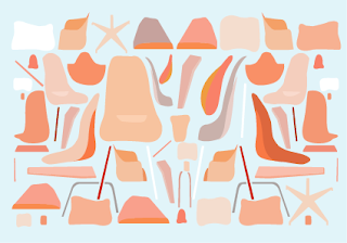
Stamps:
Overall thoughts:
- Realllly love the orange stamp, i feel like theres not too much going on but it definitely isn't simplistic, will have to see what thoughts are in the crit later on today.
- they look really good on screen and as a series of images however is the blue one too busy? I've got to remember that it will look a lot smaller printed out!! perhaps changes will be needed before the deadline. Will be able to see what people say in the crit later on today.
- is the darker blue one also too busy?
I'm still indecisive - Possible A2 Posters:
- Does the dark blue and pink image look better as an A2 print out? the business of these images work well on a bigger scale purely due to the fact you can see all of the infomation a whole lot clearer.
Post cards:
- I love each image but they dont work well as a series.
- either the colour scheme need to be chanaged or I need to have another option to make the series look more aesthetically appealing.
- The more I look at the purple and green the more I dislike...changes?


No comments:
Post a Comment