I H A T E CHOOSING COLOUR
I've always found that choosing colour is one of the most difficult things to do! its the thing that really polishes off your piece and it frustrates me so much that I find it so hard! I've tried using the Adobe colour picker but still I struggle so much and it never looks right. I decided to think back and look at some examples of work where I really appretiated the colour scheme.
One piece of work unfortunately I dont know who created it was something that I have had held of from the beggining of the year, I like to collect examples of illustrations which are on promotional flyers or leaflets promoting clubs and bars which was what this was.


One piece of work unfortunately I dont know who created it was something that I have had held of from the beggining of the year, I like to collect examples of illustrations which are on promotional flyers or leaflets promoting clubs and bars which was what this was.

Every time I've looked at it on my wall I've always appreciated the colours so I thought it would be a good idea to interpret this in my own work.

I think this piece is more successful than others, I like the unrealistic skin tones which match the un realistic body features, it's wacky and unique and I think is a potential final for my poster. Thoughts - are the colours to random? do they make sense? do they need to make sense?

The colour scheme on the piece above was designed fairly random, I decided to keep the skin nude and pinky tones to keep it fairly normal looking, and then I stuck to a turquoise, deep green colour scheme purely because I liked the look of it, I think its a nice and colourful piece and represents all the colourful Eames chairs effectively.

I also came accross this screen print a while back when focusing on the screen print brief in a previous module. again the thing about this image that attracts me most is the colour palette, consisting of only 3 colours. I love the use of the two blues and in contrast the red, also I admire the fact that white is not wasted as a colour, Till Hafenbrak has used white very effectively which expands his 3 colour palette to technically 4.
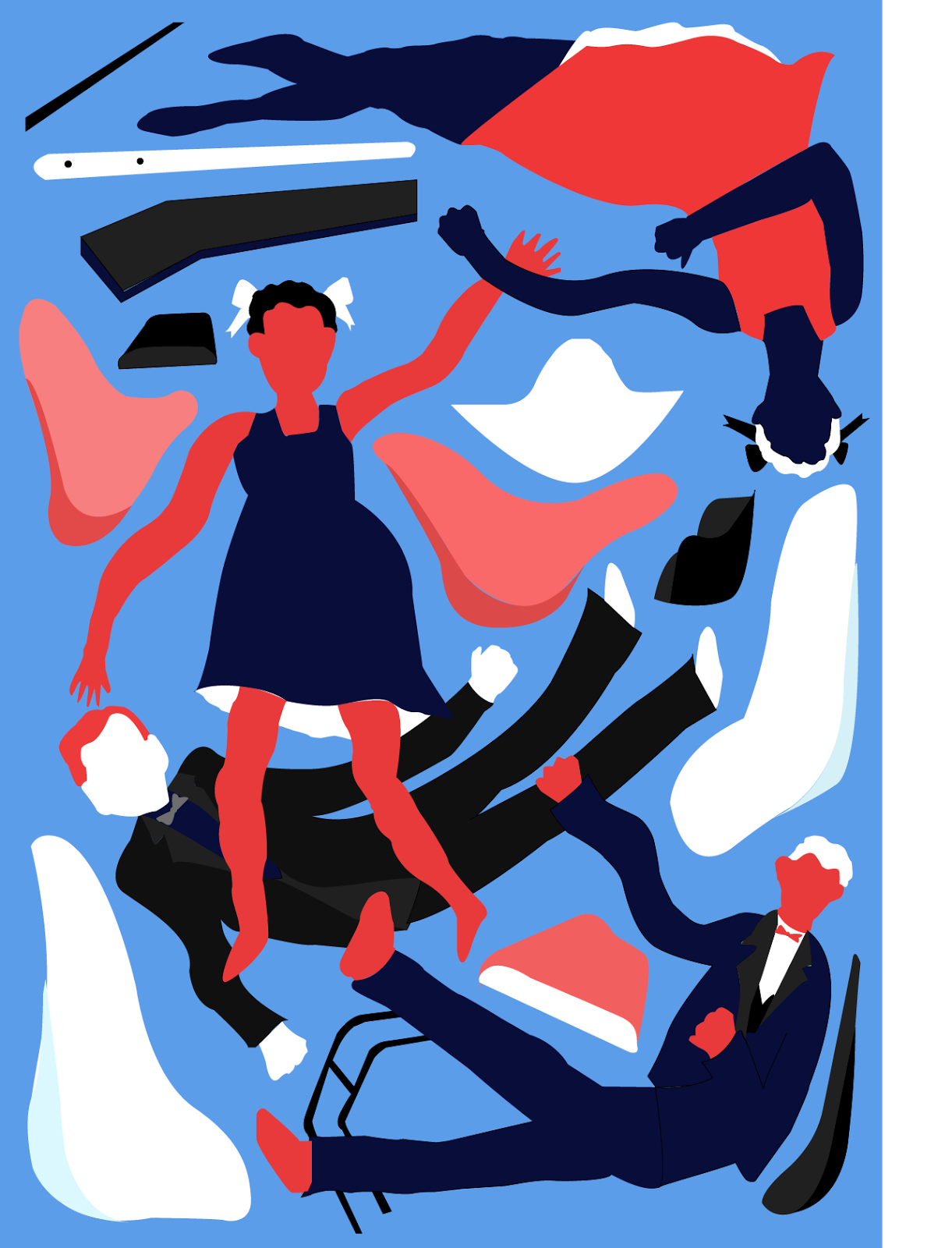
After looking at Hafenbraks work I soon discovered a similar colour scheme worked really well on my own piece of work, I feel it works extremely well in a sense of the red portrays Ray and the blue portrays Charles, although it is stereotypical it does genuinely work. again the crazy un realistic colours suit the persons of note as I feel it mirrors their personalities and ways of working. I think this is probably my favourite outcome, it links more with my research and background infomatiom and it look aesthetically pleasing.

I'm not entirely sure on this colour choice? I do really like it but I think the purple and green might contrast a little toooo much? I think more experimentation is needed really before I can decide on a final outcome. I think one thing that I'm a little unhappy with within this piece is the edges on some of the vectors - they're little sharp, think i need to work on my curves a little more to create perfection.
I got the inspiration for this colour scheme to one of my all time favourite pieces of work created by Ellakookoo, the colours are so vibrant, they literally just pop, I would've never have thought of using this colour combination without looking at this piece of work but I think they work so beautifully as to why I tried something similar.

No comments:
Post a Comment